Redesign of the mobile web car rental reservation experience and the Android/iOS mobile apps.
UX Developer Intern
User Interface Design,
Frontend Development
The Hertz Corporation is United States' largest car rental company by sales. They offer the world's most diverse global car rental brand portfolio with the combination of Hertz, Dollar, Thrifty and Firefly brands. Together, they serve in nearly 150 countries worldwide with over 10,300 locations. Besides offering car rentals, Hertz also provides additional services with their subsidiaries: Hertz Car Sales, Hertz Equipment Rental, and Hertz 24/7.
I joined the Hertz Corporation in May 2014 as a UX Developer Intern. I worked under the technology team during the inception of their new design team consisting of two other designers. As a result, I had the opportunity to lead and pave the way for what would become the future of user experience at Hertz. During my internship there, I had the privilege of working on some major projects for Hertz.com, the iOS and Android app for car rental, and developing their UI patterns library.
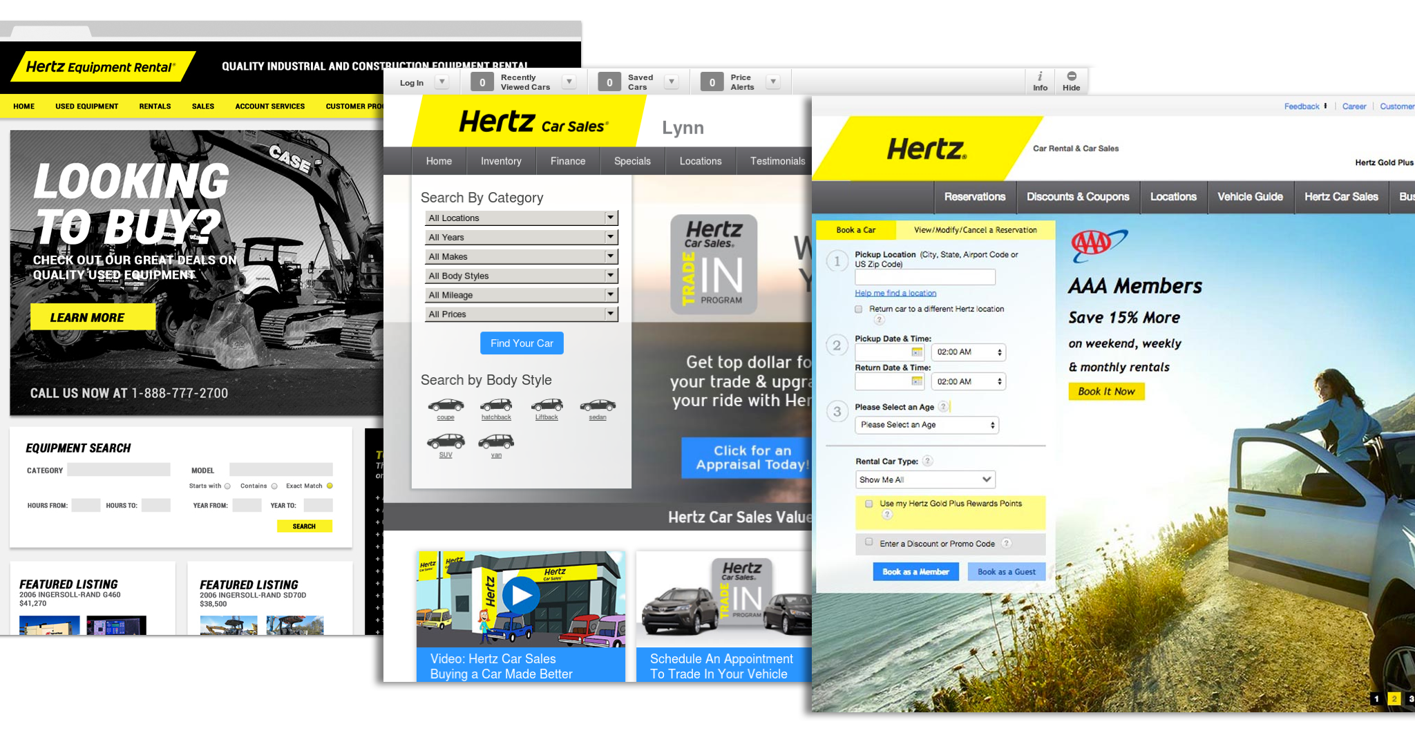
One of the first things I noticed immediately during my internship was the level of inconsistencies that existed across the entire Hertz digital ecosystem between all the subsidiary websites. At a higher level, while the car rental website was fully responsive, other sites were built adaptively and or not optimized for mobile devices at all. At a much deeper level, there were inconsistiences with typography, colors, and components of the user interface, such as buttons, navigation and form elements.
I immediately recognized this as an issue that interfered with a seamless experience for users between devices, websites, and experiences within the websites. Upon investigating, I quickly learned that developers within different scrums teams were developing and designing their own components and reusing the code that was available to them across various experiences. The need for efficiency and reusability of UI elements existed, but due to lack of documentation and standards around the usage of these elements caused the problem of having these inconsistent experiences.
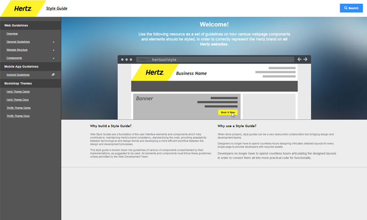
While I was navigating through the cubicles to speak with developers in the different scrum teams, I noticed each of their desks had a bulgy binder that was collecting dust. It turned out that the binder included pages of documented brand guidelines (mostly for print) including proper usage of typography, colors and best practices. This is exactly what we needed, but digitally to meet the needs of the technology team by including proper code and documentation for digital use. In a cross-functional collaborative effort, I self-started a project to build the Hertz design system. Design system wasn't a term that was coined yet in the industry, so we called it our "global styleguide."
Utilizing what I had known at the time, I began developing the styleguide using Bootstrap, PHP, and some additional JavaScript. Thinking back, PHP probably wasn't the best language to utilize but at the time it was a language I felt most comfortable with. It made it easier for me to scale and maintain the styleguide on an on-going basis to ensure it we had a living styleguide by using includes. This helped provide better documentation for reusing code and maintaining consistency amongst all Hertz brands and divisions for a more seamless user experience. With the help of another developer, we also designed Bootstrap themes for various Hertz brands and allowed users to download them through the style guide for future projects and for faster implementation. This also helped us with testing and quality assurance.
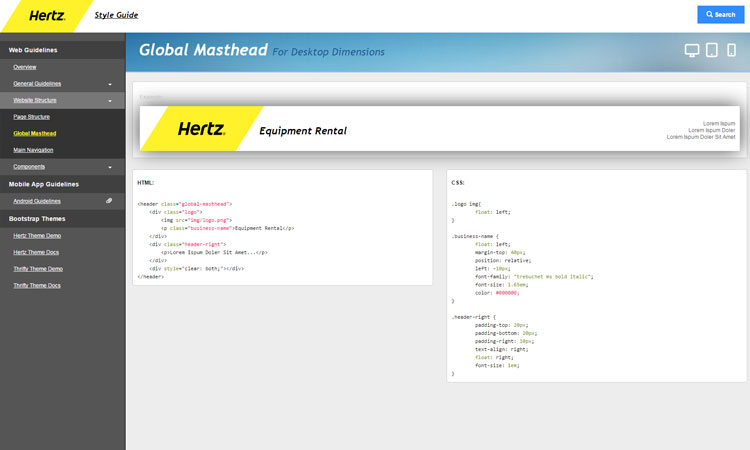
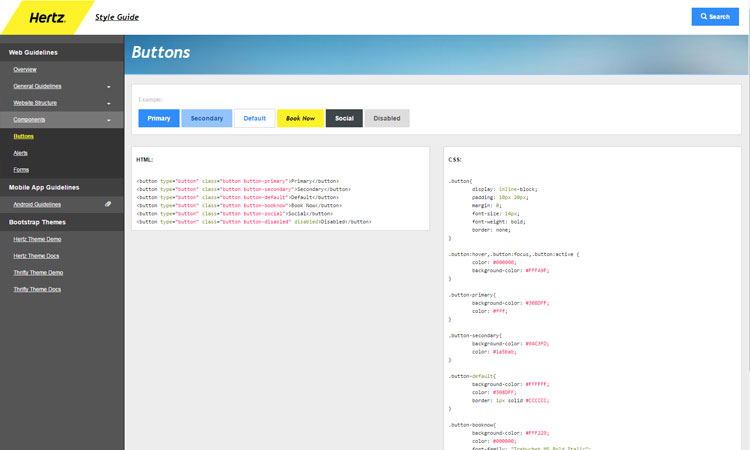
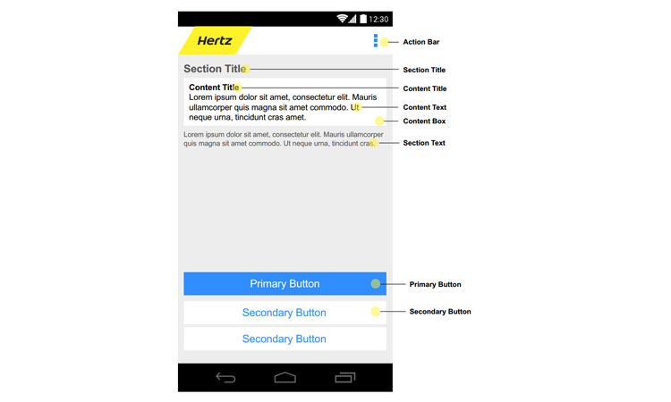
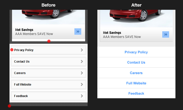
Before the styleguide, developers hadn't used a central framework for their work. For example, there was no grid system. So, instead of communicating using language like "6 columns" and "12 column", we had to communicate using "2-up" or "1-up", which was lingo commonly used for print. Introducing a framework and documentation from the styleguide, we were beginning to bridge the gap that existed between the design and development teams. It provided us with a universal language to help us not only communicate, but implement more efficiently and consistently across all devices for a better standardized and seamless experience for users.
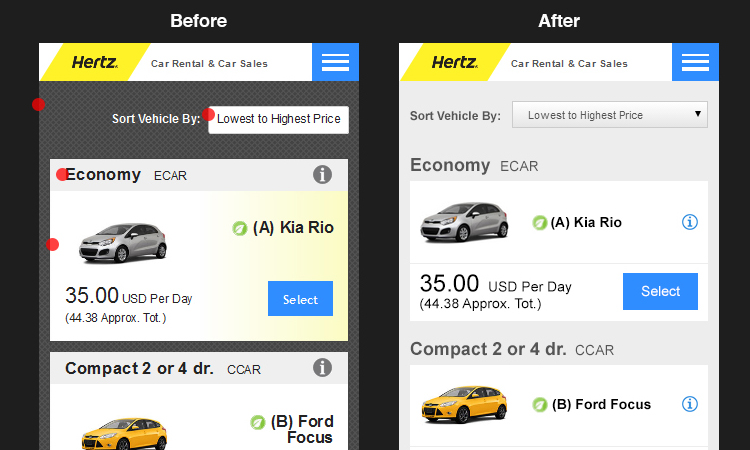
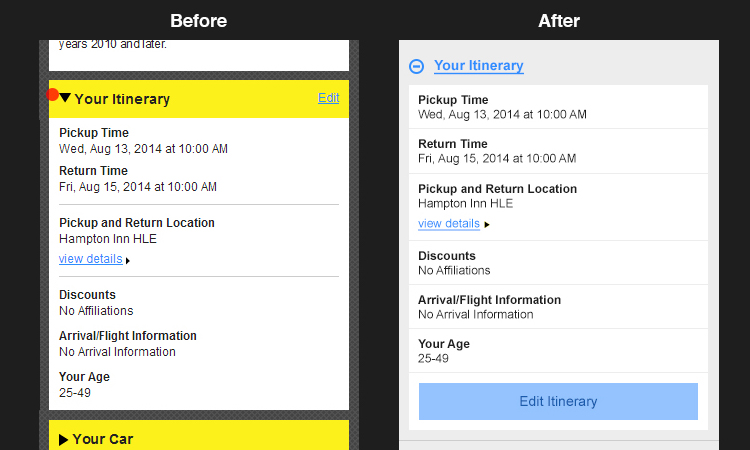
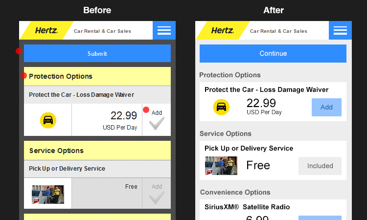
As we were beginning to start seeing a positive impact of the styleguide, we brought our project to the VP of Technology who immediately elevated the styleguide to the global brand strategist for Hertz. After receiving an approval from a brand perspective, we published the styleguide to be referenced by Hertz brands globally. Our next steps were to begin transforming our digital experiences to now follow the styleguide, starting with the web reservation process.
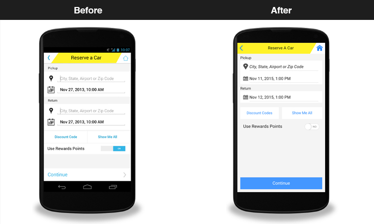
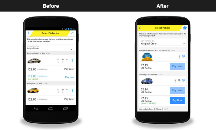
While I was working on the styleguide, the technology team had just finished making the Car Rental website fully responsive. I was brought in to conduct an audit and update the new car rental reservation process to adhere to our new standards and consult on improving the overall user experience. Taking a mobile-first approach, I worked closely with the development team to redesign and implement the new experience.
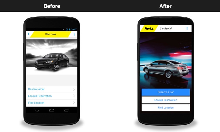
Hundreds and hundreds of bad reviews flooded the Google Play Store as the Hertz Android app needed a desperate makeover. The Hertz Android app hadn't been updated in years and was leading to poor customer experience. In fact, it had grown out of compatiblity with the latest Android phones, so the app entirely was outdated.
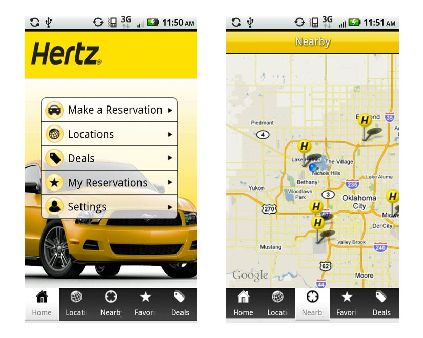
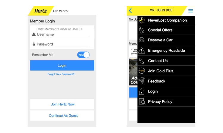
The development team had already started working on developing the new mobile apps using a hybrid-approach, verses developing the app natively. This gave us another opportunity to utilize what we already had developed with the global styleguide and expand it to include documentation relating to the mobile standards for iOS and Android. We conducted another audit and began to redesign the app with our new standards. To help communicate the intended interactions of the apps, I also rapidly developed prototypes using AxureRP. This helped save us lots of time understanding the functionality of the app, especially with a tight deadline.
Ideally, we would've had the opportunity to craft a better end-to-end experience by taking a more human-centric approach from the beginning. However, even with tight deadlines and most of the initatives already in flight during the period of my internship, we were still able to make a huge impact for the customers using the new global styleguide. In fact, the The iOS app became the only 4-star rated travel-provider app and the Hertz Android app had a 62% increase in 5-star ratings and 91% in 4-star ratings within 4 months of launch.