A personal project to understand and solve a problem for people in modern online dating apps.
Product Designer
Visual Identity, Marketing
Website Design/Development
Over the past decade online dating has lost much of it's stigma in the United States. Match.com became the first online dating service in April 1995. Then, only 14% of Americans had access to the internet. Today, nearly nine-in-ten Americans are online, and online dating has grown in both popularity and acceptance.
According to Pew Research, majority of Americans now say online dating is a good way to meet new people. In fact, almost half of the public knows someone who uses online dating or has met their spouse, or partner, through online dating. Two-thirds of all online daters - 66% - have gone on a date with someone they've met through a dating site or app. In terms of demographics, online dating is most common amoung Americans in their mid-20s through mid-40s. The 25-34 year olds age group represents the most popular age group that utilizes a online dating service. With a recent introduction of the popular dating app Tinder, these numbers have spiked in growth even more.
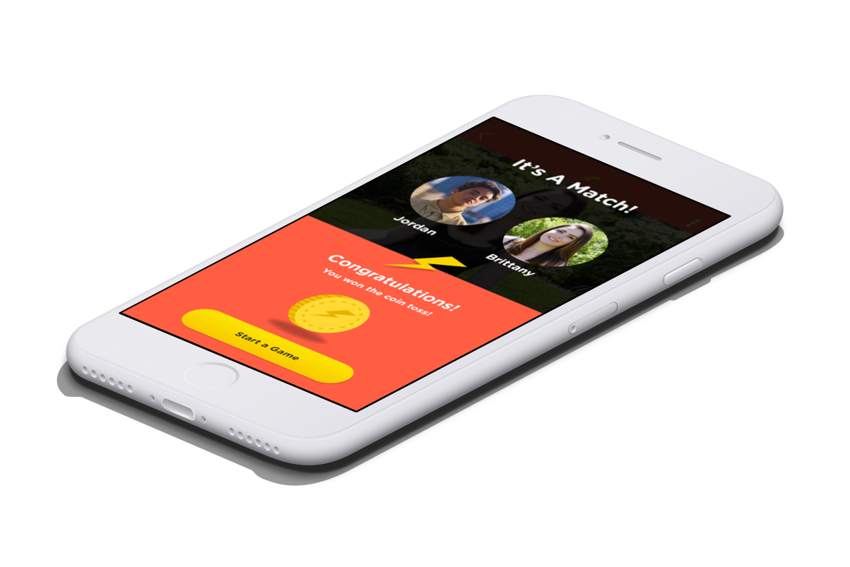
FRNDZY is a mobile app concept that I designed as a side project to improve the overall communication experience in online dating. The app introduces a series of "ice-breaker" games to provide users with context before initiating their conversations. The idea was to help eliminate cold messaging and drive matchmaking through social conversations to form more meaningful impressions.
Taking a closer look into the secondary research that was available online, I needed to take it a step further to truly understand the exact issues people were facing. I produced a survey and shared it community of college students in my area. Ideally, I would have prefered recruit participants from across the nation, but my results were based on participants from the Greater NYC area due to the limited resources I had available at the time. Using the gathered data, I analyzed it using SPSS and gathered some key findings.
Negative experiences in online dating are quite common. Primary frustrations in online dating stem from perceived limitations in existing online dating communication methods to form meaningful impressions. Currently, these existing methods don't allow for how fast or how much information users can convey about themselves as well as gather from others with the space that is provided to them. As a result, primary impressions are often dependent upon characteristics such as physical attractiveness from profile pictures or self-written subjective summaries, allowing for vulnerability in falsified or falsely-assumed impressions.
Women are much more likely than men to have experienced uncomfortable contact via online dating sites or apps: some 42% of female online daters have experienced this type of contact at one point or another, compared with 17% of men. Most of these frustations may occur because users are unsure of how to lead their conversations due to a lack of shared context.
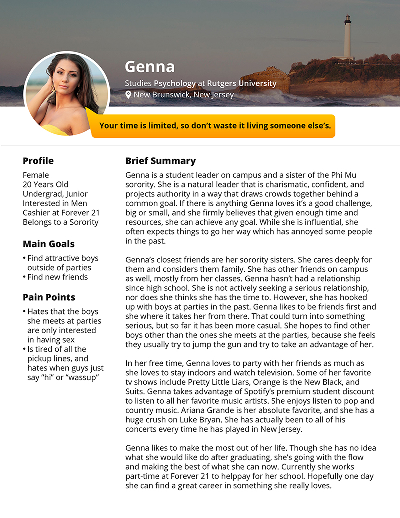
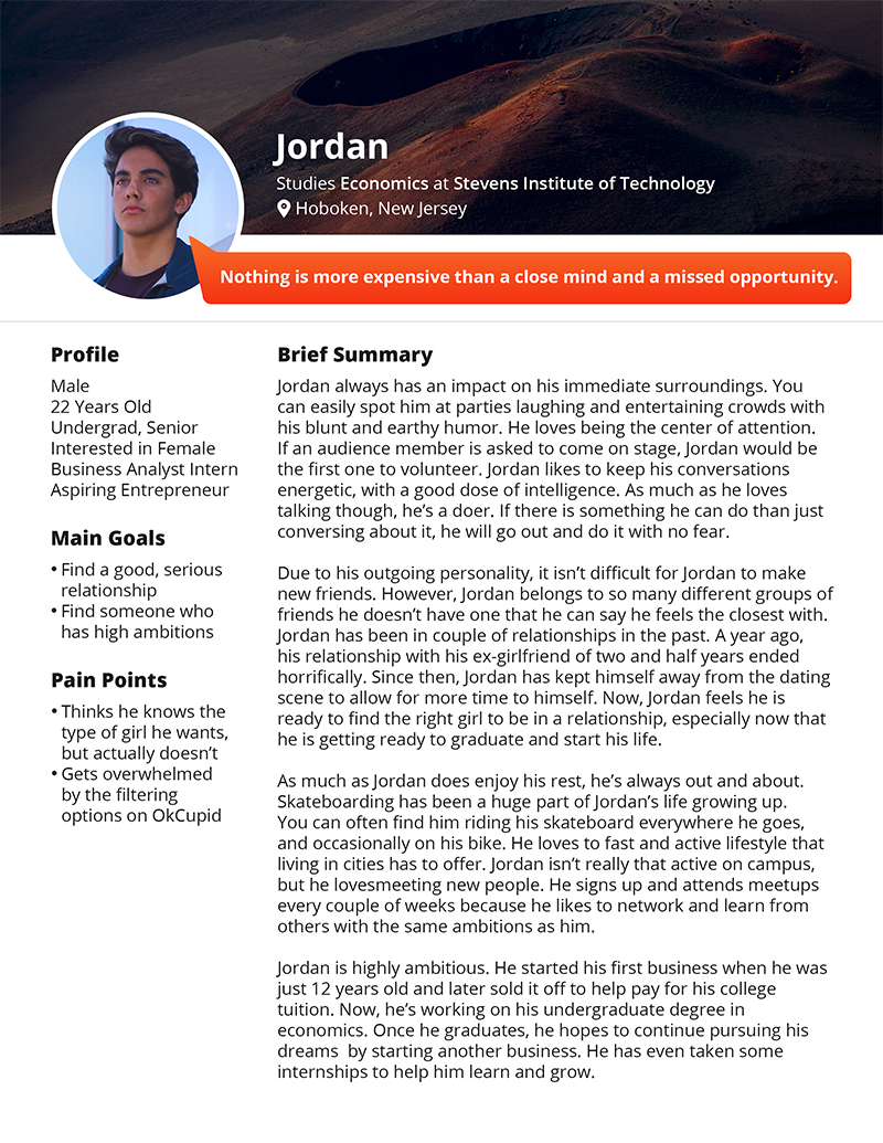
Using the research, I created 8 different user personas to help me focus on their goals, current behavior, and pain points. I used these personas to tell a story and describe what users need, how they think, and why they behave the way they do. This deep understanding of users helps effectively deliver a great tailored experience by making them the central focus during every step of the design process.
Using these user personas, I practiced scenerio-based design by writing pre-intervention and post-intervention scenerios for each persona. These scenerios tell a story about how life would be like for these personas before the introduction of FRENDZY to understand how each of their conflicts facing online dating, or dating in general, were different. The post-intervention scenerios helped identify the key solutions that FRNDZY could provide to help solve these conflicts.
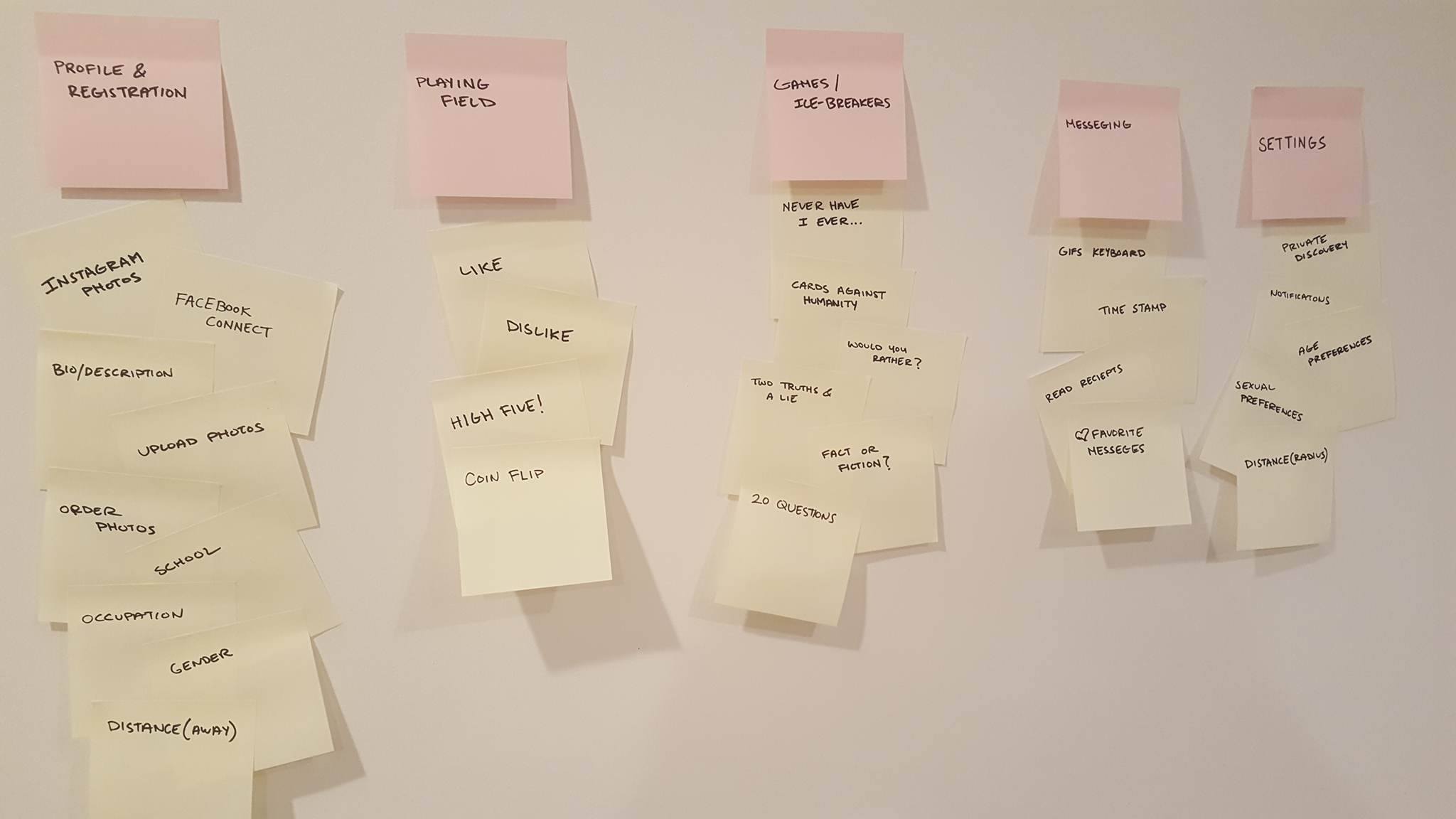
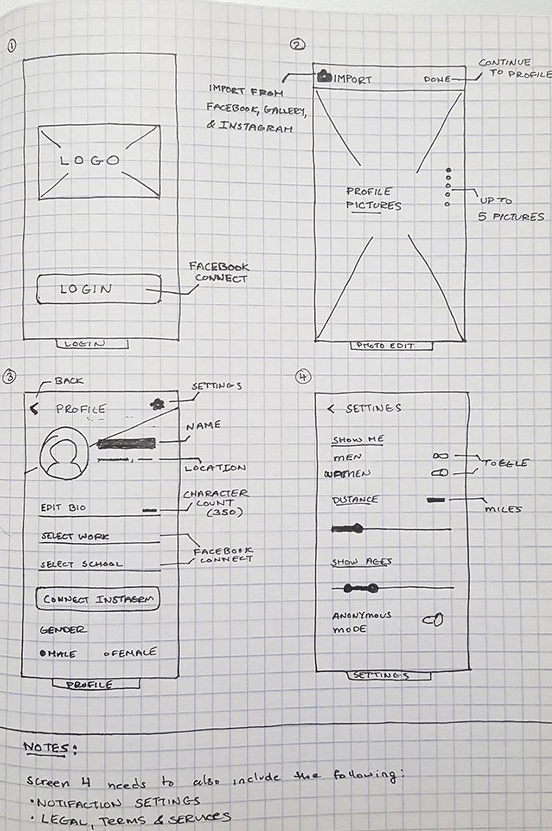
After drawing the research from participants, I facilitated a closed card-sorting exercise moderating a group of select participants. This helped form an anatomy of the features, developing the overall information architecture.
Keeping in mind the anatomy of the app, I started to draw rough sketches of the intended design. Keeping the personas in mind. When the design felt right, I raised the fidelity of the wireframes and translated into a digital version. Ideally, during this step, it would have been beneficial to validate the design by putting it in fron to of the participants again.
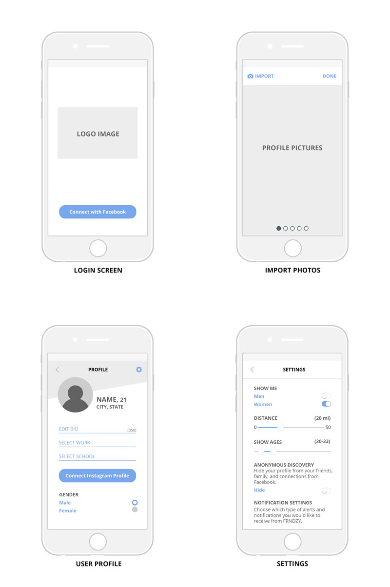
Using the wireframes as a blueprint, I raised the fidelity once again by starting to introduce more detail and visual elements to the app. This is when it was crucial to solidify the intended interactions and functionality of how our personas would use the app.
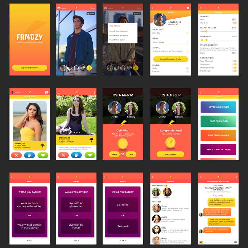
Using Invision's prototyping features, I began compiling the mockups to build an interactive prototype. This started to bring functionality to what was just some static images before.